Graduated vector styling
The graduated vector style applies one symbol per range of numeric attribute values. This vector style is best when you want a different symbol that is based on a range of numeric attribute values, such as when styling gross domestic product polygons or city population points. The graduated vector style works best with ordinal, interval, and ratio numeric attribute data.
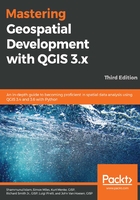
The following screenshot shows the Graduated style type with parameters for a point dataset that contains surveying levels:

Styling vector data with the Graduated style type is a five-step process, which is as follows:
- Select an appropriate value for the Column field to use the attributes for classification. The following five modes are available for use:
- Equal Interval: In this mode, the width of each class is set to be the same. For example, if input values ranged between 1 and 100 and four classes were desired, then the class ranges would be 1-25, 26-50, 51-75, and 76-100, so that there were 25 values in each class.
- Quantile (Equal Count): In this mode, the number of records in each class is distributed as equally as possible, with lower classes being overloaded with the remaining records if a perfectly equal distribution is not possible. For example, if there are fourteen records and three classes, then the lowest two classes would contain five records each and the highest class would contain four records.
- Natural Breaks (Jenks): The Jenks Breaks method maximizes homogeneity within classes and creates class breaks that are based on natural data trends.
- Standard Deviation: In this mode, classes represent standard deviations above and below the mean record values. Based on how many classes are selected, the number of standard deviations in each class will change.
- Pretty Breaks: This creates class boundaries that are round numbers to make it easier for humans to delineate classes.
- Create the classes to list by either clicking on the Classify button to add a class for each unique attribute that is found; otherwise, click on the Add Class button to add an empty class and then double-click in the Value column to set the attribute value range to be used to create the class.
- Classes can be removed with the Delete or Delete All buttons. They can be reordered by clicking and dragging them up and down the list. Classes can also be modified by double-clicking in the Value and Legend columns.
- Set the symbol for all classes by clicking on the Symbol button to open the Symbol selector window. Individual class symbols can be changed by double-clicking on the Symbol column of the class list.
- Choose the Color ramp to apply to the classes. Individual class colors can be changed by double-clicking on the Symbol column of the class list.
The Legend Format field sets the format for all labels. Anything can be typed in the textbox. The lower boundary of the class will be inserted where %1 is typed in the textbox, and the upper boundary of the class will be inserted where %2 is typed.
If Link class boundaries is checked, then the adjacent class boundary values will be automatically changed to be adjacent if any of the class boundaries are manually changed.
Other symbol options, such as transparency, color, and output unit, are available by right-clicking on a category row. Advanced settings are available by clicking on the Advanced button.
The Histogram tab (shown in the following screenshot) allows you to visualize the distribution of the values in the selected column. It is often useful to view the histogram before you decide on the classification method to gain an overview of the distribution of the data and to quickly identify any outliers, skew, large gaps, or other characteristics that may affect your classification choice.
To view the data in the histogram, click on the Load values button. You can change the number of bars in the histogram by modifying the value in the Histogram bins box. You can view the mean and standard deviation by checking the Show mean value and Show standard deviation boxes, respectively.